
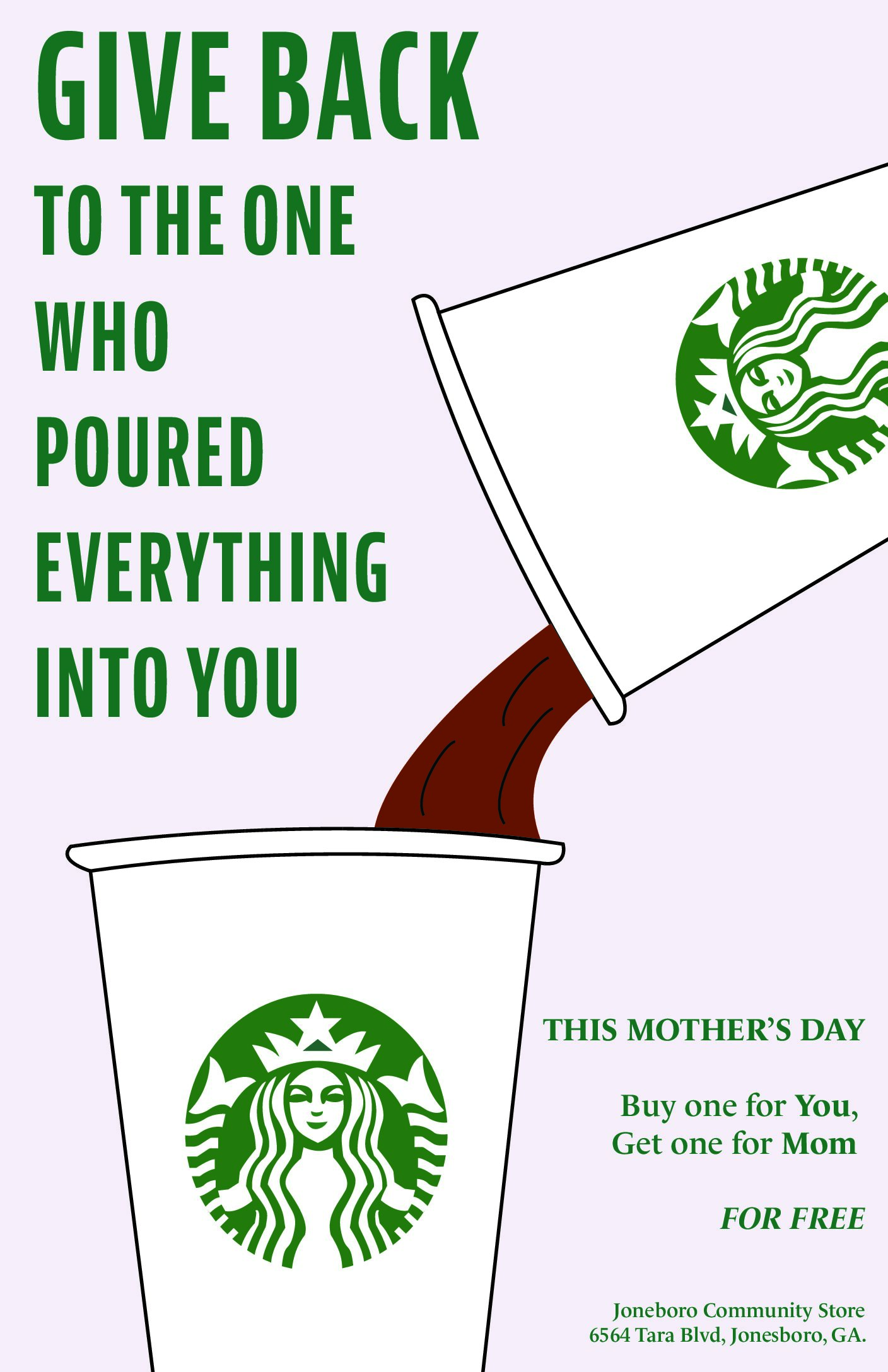
In my Vector Illustration class, we used Adobe Illustration, and we were given the goal was to create a holiday-themed promotional poster for a Starbucks in Jonesboro, Georgia. We wanted this project to reflect that connection between the Starbucks and the community, and continue building relationships by making customers feel loved and appreciated, particularly during the holidays.
There were two main objectives with this project: to draw customers in with a great deal, and to inspire kindness and generosity. The promotion is designed not only to increase store traffic but also to help people make a meaningful gesture toward someone they care about. With that in mind, the chosen holiday for this campaign is Mother's Day, and the design features the iconic Starbucks green and a pink theme to reflect the brand and the idea of Mother's Day.
After exploring several ideas, which included launching a new drink flavor or discounting specific drinks, I decided the best approach was a "buy one, get one free" offer. This simple concept encourages customers to treat themselves and also gift a drink to their mother or a mother figure in the community. Given that Jonesboro is a low-income area, this small act of giving could make a large impact.
In the final design, I made several layout adjustments to improve clarity and emphasis. I enlarged the phrase "give back" to highlight the heart of the campaign, which is showing love and appreciation for moms. Throughout the project I refined the cup placement, text size, and alignment for better visual balance. The call-to-action in the lower right was simplified to ensure it’s clear and accessible.
Overall, this poster reflects our commitment to community, kindness, and thoughtful design which was centered around honoring mothers on their special day.
This assignment helped me realize how design can be used not just to advertise, but to uplift and connect with people on an emotional level. Working on a campaign like this required me to think beyond aesthetics, as I had to consider tone, messaging, and real-world impact. I focused on how the visuals could reflect love and gratitude, especially in a location where even small gestures go a long way.
One of the biggest takeaways for me was learning how to put myself into the shoes of the audience. From choosing color palettes that evoke warmth and comfort to writing copy that felt genuine and approachable, every element needed to serve a greater purpose. I also learned how to balance branding with creativity by staying true to Starbucks’ visual identity while still making the poster feel local, and personal.
This project also helped sharpen my technical skills with vector tools, especially in creating scalable, print-ready graphics. I now feel more confident in using Illustrator for real-world marketing campaigns and understand how much thought goes into every detail of visual communication.
It was rewarding to see how a simple classroom assignment could turn into a meaningful, community-centered design. I’m excited to carry these lessons into future projects where creativity meets purpose.