Magazine Cover Recreation
I was tasked to recreate a magazine of my choice using Adobe Photoshop for my Digital Imaging class. I wanted to recreate a magazine cover that reflected my passion for sports while incorporating a clean yet visually striking design. Being a lifelong New York Mets fan, I naturally gravitated toward baseball-themed concepts. My initial inspiration came from browsing various Mets magazine covers, especially those from past decades. I was particularly drawn to the nostalgic appeal of vintage sports magazines—the texture, typography, and overall aesthetic felt both classic and unique.
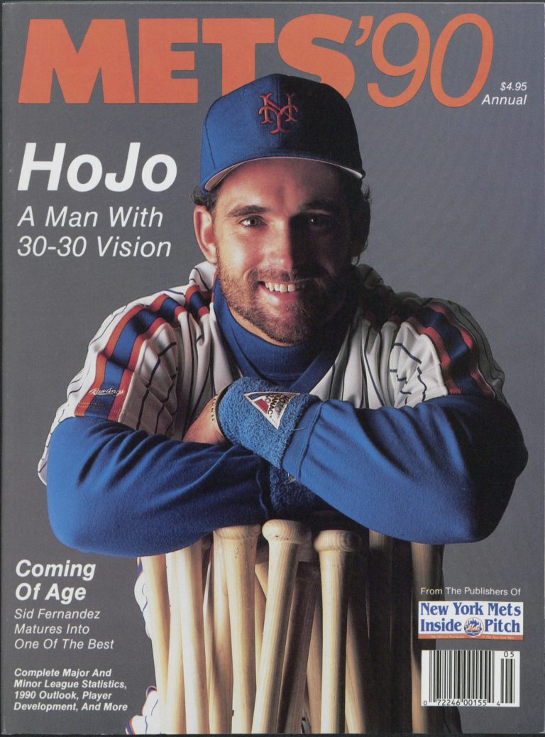
Since I already had some Mets gear, I decided to step in front of the camera myself for the cover photo. This made the design more personal and authentic. I created a makeshift setup, shining a lamp into a mirror to try to mimic the lighting of the original magazine.
One of the main goals of this piece was to find various similar fonts to the original and keeping the overall layout simple and readable. I experimented with multiple typefaces to match the era and original style. I also worked on editing techniques, including photo masking and increasing noise, to create a believable retro look.
This project gave me a great opportunity to combine photography, design, and personal interest into one cohesive piece. It not only allowed me to explore vintage design trends but also helped strengthen my layout and typography skills in a creative and meaningful way.
As I continued to refine the project, I realized how important the smallest design elements were—details like the placement of a barcode, the texture of paper, or even the tone of the colors used made a huge difference in trying to get as close as I could to the original magazine cover. I spent time researching old magazine covers and learning how to utilize specific tools in photoshop to create an older magazine feel. Adding that level of detail brought my final design to life, and I was able to vision it as an actual magazine cover from the past.
The process also pushed me to be resourceful. With limited equipment, I had to find creative ways to simulate professional lighting and backdrops. The DIY photo shoot with a lamp and mirror was most definitely not high-end, but it allowed me to better understand how lighting influences mood and texture in photography. It was a great reminder that strong design doesn’t always require top of the line tools, but instead a clear vision and some creative thinking.
One of the most rewarding parts of the assignment was seeing how personal interest can fuel creative energy. Because the project was tied to something I genuinely cared about, which is the Mets and baseball, I found myself more motivated and invested. I wasn’t just completing an assignment; I was building something that felt meaningful to me that I could show my friends and parents and be proud about.
Overall, this assignment reminded me of the power of storytelling through design. It was more than just trying to accurately replicate my look, as it was about capturing a feeling, a memory, and a piece of culture, all through visual expression. I look forward to continuing to blend my passions and design skills in future projects.